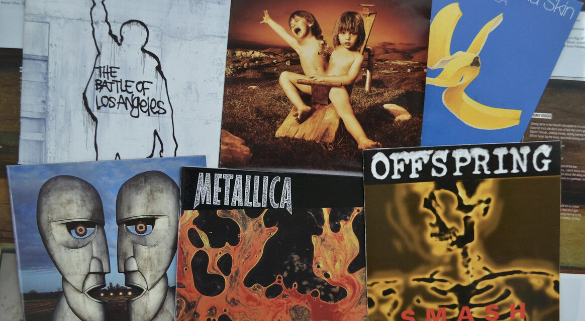
Before you’ve heard a single note, you’ve already formed an opinion about what you’re about to hear. That’s what album art does. It lands in your feed, shows up on a merch table, loads on Spotify – and in the second before you press play, it’s already doing serious work.
The visual layer of music has always mattered, but the fragmented media landscape of 2026 has made it matter differently. An artist’s visual identity now needs to function across a dozen surfaces simultaneously, and the design decisions that hold up across all of them are the ones worth paying attention to.
Why Album Art Still Carries Weight
Album covers have been a legitimate creative medium in their own right since the LP era. The relationship between what an album sounds like and what it looks like is one of the more interesting design problems in music – done well, the visual and the sonic feel like expressions of the same idea. Done poorly, they don’t align, and the disconnect undermines both.
Creative branding and design trends in entertainment have tracked a shift in how that relationship is being handled. The streaming era briefly seemed like it might diminish the importance of cover art – smaller thumbnails, less context, less ritual around the physical object.
What actually happened is that the visual identity of a release has become more important, not less, because it has to work at thumbnail scale and at poster scale, in motion and in static form, alone and alongside dozens of other thumbnails in a playlist.
The artists whose releases create a visual impression that genuinely sticks are the ones treating cover art as the opening frame of a larger visual world – not a standalone image, but the first expression of a system that extends through the singles, the video treatments, the merch, and the live experience.
What makes album art work in the current environment:
- Recognizability at small scale – the thumbnail test is real; an image that reads clearly at 40 pixels has a structural advantage over one that requires the full-size version to understand
- Visual consistency with the sound – texture, palette, and composition choices that feel like they emerged from the same creative space as the music, not a separate design brief
- Flexibility across uses – imagery that can be cropped, extended, animated, and applied to different proportions without losing the essential character
The Artist Website as Identity Statement
The artist website has had a complicated decade. During the social media dominance of the early 2010s, many artists effectively abandoned their own sites in favor of Instagram and Twitter.
The limitations of that approach have become much clearer over time: you don’t control the algorithm, the platform can change or disappear entirely, and the format constrains what you can actually express about who you are.
The artists treating their website seriously in 2026 are using it as the one place they fully own – where the visual identity can be expressed at full fidelity, without compression or cropping, and where the relationship with the audience isn’t mediated by a platform’s priorities or monetization goals. That shift in thinking has changed what the best music sites actually look like.
Typography, motion, scroll behavior, sound design, photography direction – all of these are active and deliberate elements in how an artist communicates identity through a site.
The site for a post-punk band and the site for an ambient producer can both be technically well-built and still feel completely different, because the design choices are doing the real work of saying something about who the artist is before any text is read.
What separates genuinely effective artist websites from ones that just exist:
- A clear point of view – the design decisions feel like they came from the artist’s world, not from a template or a generic creative brief
- Motion used deliberately – animation and transitions that reflect the energy of the music rather than decorative effects applied without thought
- Merchandising integration – merch that extends the visual language of the releases, presented in an environment that makes it feel like part of the work rather than a revenue sidebar
- Consistent update frequency – a site that’s clearly maintained signals that the artist is active; one that’s clearly stale does the opposite
The Merch Question
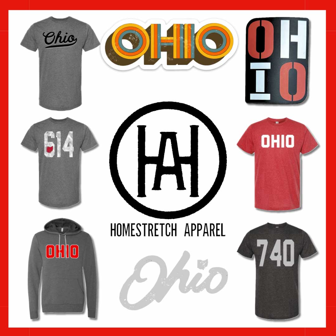
Merchandise has always been where music branding meets commercial reality. The t-shirt someone wears is a walking ambassador for an artist’s visual identity – which makes the design decision more consequential than most bands actually treat it. Generic band name plus tour dates is the floor, not the standard.
The artists building real brand recognition through merch are treating it as a creative extension rather than a revenue mechanism.
Collaborations with illustrators and designers, limited drops that reference specific releases, and garments that people would wear even if they hadn’t heard the music – these build a visual presence that travels well beyond the fanbase and into broader culture.
The visual consistency between what something sounds like, what it looks like on the cover, how the site represents it, and what the merch says about it is what separates artists with a brand from artists with just a name. The former tend to stick around in culture long after the latter have been forgotten.